
Paramount Pacifix Property Development: the brief, point by point
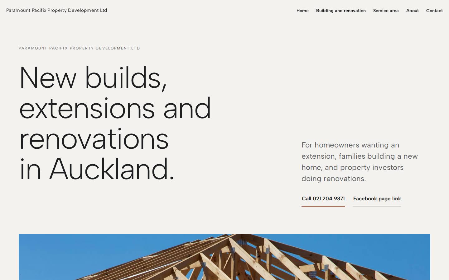
They wanted to look more professional and bring in more work, so the build leads with a plain statement of what they do and where, then makes the phone number, letterhead and social link impossible to miss.
See the demo (paramount-pacifix-property-development-ltd.preview.ceasmith.com) ↗
- They asked
A phone number people can find and use straight away.
We builtThe number sits in the header of every page and is set large in the home hero as a tap-to-call action. It repeats in the closing ask, on the contact page and in the footer.
- They asked
A business letterhead.
We builtAn A4 letterhead on the home page, built from the company name, phone, email and Auckland. A working print button prints only the sheet. It also appears on the contact page.
- They asked
Links to their social pages.
We builtA social page link sits in the home hero actions, on the letterhead, on the contact page and in the footer. It opens a search for the business name until the real page link is supplied.
- They asked
To look more professional.
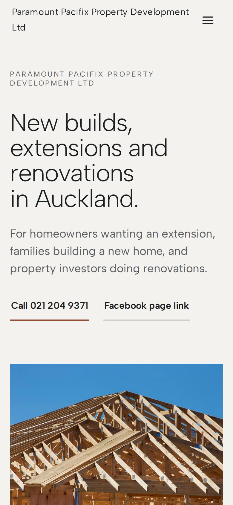
We builtA quiet gallery-wall layout: large photographs labelled as examples, light type, one terracotta accent. The full company name sits above the home headline, so it is the first thing read.
- They asked
To bring in more work for new builds, extensions and renovations in Auckland.
We builtThe home headline names all three services and the town in its first line. The lede below it speaks to homeowners wanting an extension, families building a new home and investors renovating.
The thinking behind it
The demo is based on the owner's call notes and on three kinds of Auckland residential builder site, read as category conventions.
A gallery wall: big quiet photographs, light Albert Sans set small and wide, and space used as a material. Timber framing and finished rooms hang like prints on a stone ground, with a sheet of their own letterhead pinned among them. Photos carry the colour and are labelled as examples. The footer is the one dark band.
The signature moment
The letterhead sheet. Their own must-have, built literally: an A4 letterhead on the home page showing the company name, phone, email, Auckland and social page link. It sits on the stone ground like a print on a wall and rises into place once on first view. A print button prints only the sheet. It uses only details the owner gave.
What we looked at
What we tookOne ask per page, photographs as the main surface and very little copy.
What we tookThe service page is ordered by who it is for, using the three customer types the owner named, not by a feature list.
What we tookThe phone number is visible in the first screen of the home page.
The build sheet
Colour
Type
Albert Sans for headlines, Albert Sans for reading.
Pages
- Home
- States the three services and Auckland in the headline, puts the phone number first and shows the letterhead.
- Building and renovation
- One service page with a section each for new builds, extensions and renovations, ordered by customer type.
- Contact
- Phone number, social page link and the letterhead again.
Search built in
- Page title pattern: New builds, extensions and renovations in Auckland, then the short company name.
- The meta description names the company, its three services and Auckland, and invites a call.
- Home page structured data covers a general contractor, an administrative area and a postal address.
- An llms.txt summary file is published.
A free demo website we built for Paramount Pacifix Property Development before they had paid anything.
Want a demo built for yours?
A few minutes of questions on your phone. Richard builds a demo of your site, free, and you decide from there.