
Researching Sapphire Dental: what we found in Auckland dentistry
Dental sites that win trust put booking in reach at once and give implants a page of their own. That shaped a booking-first demo for Sapphire Dental.
- Trade
- Dental practice
- Place
- Auckland
- Kinds of site studied
- 3
- Findings
- 4
What we found, and what it meant
The national NZ dental group we studied makes booking the spine of the site. One wording is repeated everywhere and booking is never more than one tap away.
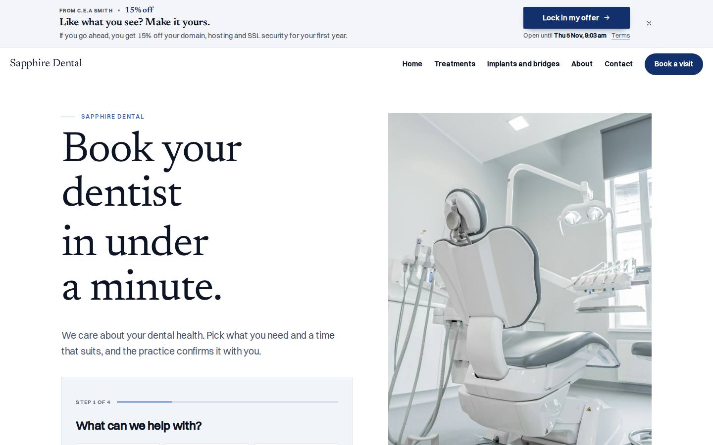
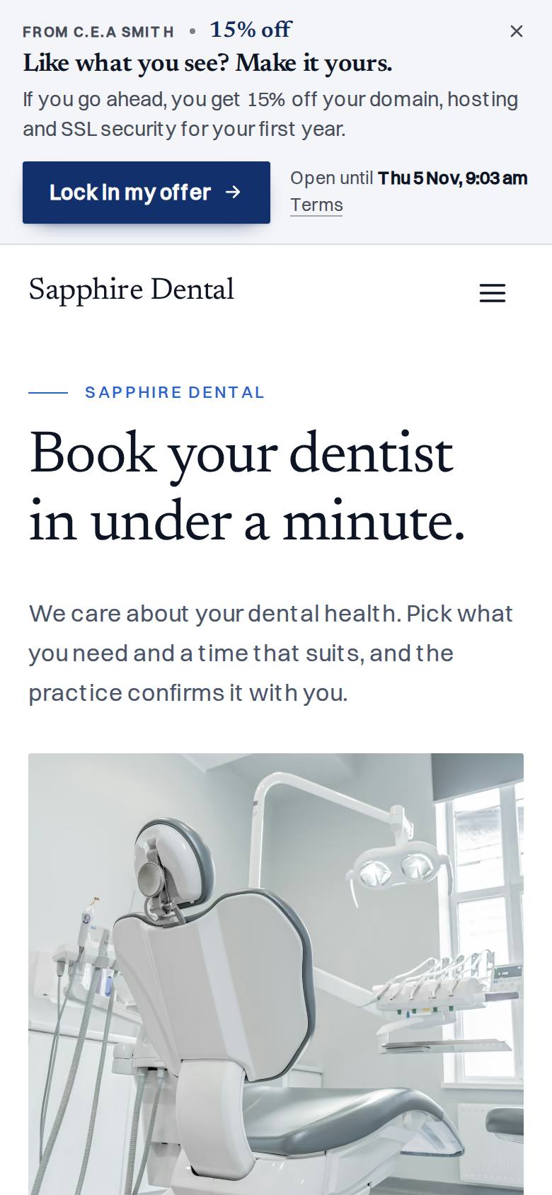
Booking is the first thing on the Sapphire Dental home page. Every button uses the same wording, Book a visit, and opens the same booking flow.
A UK dental chain gives each big treatment its own page, because people research implants by themselves and decide slowly.
Implants and bridges get their own calm page, with a numbered sequence on how an implant is built. This suits the owner's aim of more implant and bridge patients.
The US practice we looked at sells the feeling of the room before the clinical list. Its booking works like an app, and calm rooms with a soft, cool palette are what modern means to a patient.
The build uses white stock, deep sapphire and room photography, with no faces. The booking flow ends in an appointment card, like the reminder card a practice hands over.
The national group works as a network and puts a location finder first. Sapphire Dental is one practice in Auckland.
There is no location finder and no network feel. The site reads as one practice with one booking route, repeated as the whole contact page.
How we looked
I studied three kinds of dental site: a national NZ group, a US practice and a UK chain. I noted their titles, headlines and booking wording, and how each handled booking, rooms and treatments. Then I set that against what the owner asked for before any design was drawn.
What we tookBooking never more than one tap away, with the same button wording everywhere.
What we leftThis is one practice, so it has no location finder and no network feel.
What we tookCalm room photography, a soft cool palette and a booking flow that feels like an app.
What we leftThis build shows rooms, instruments and models only, with no faces.
What we tookEach major treatment, implants especially, gets its own page because people weigh it slowly.
Where it led
A quiet, cool-lit clinic brochure on bright white stock. Large photographs of calm rooms and precise models, one light literary serif, a crisp Swiss sans for reading, and a single deep sapphire ink. Booking a dentist should feel as considered as the care.
The signature moment
The appointment card. A visitor picks a treatment, how soon, a day and morning or afternoon, then leaves a name and number. An appointment card slides up with a summary and a reference, like the reminder card a practice hands you. It says plainly that this is a demo and nothing was sent. A quieter moment on the implants page pairs a numbered build sequence with a sticky cross-section model photo.
The build sheet
Colour
Type
Newsreader for headlines, Switzer for reading.
Pages
- Home
- Booking first in the hero, then treatments, the implant band, first visit steps and rooms.
- Implants and bridges
- A calm explainer for people deciding slowly, with the numbered build sequence.
- Contact
- The booking flow again as the whole page.
Search built in
- Page title pattern: Book your dentist online | Sapphire Dental.
- Meta description names check-ups, implants, crowns and bridges, root canals and IV sedation.
- The description promises a treatment and a time picked online in under a minute.
- Structured data on the home page uses the Dentist type.
- An llms.txt summary file is published.
A free demo website we built for Sapphire Dental before they had paid anything.
Want a demo built for yours?
A few minutes of questions on your phone. Richard builds a demo of your site, free, and you decide from there.